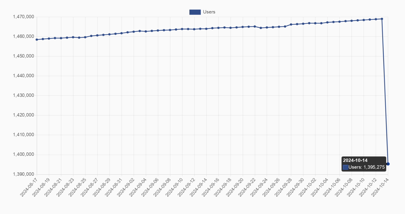
Cool then it should be 5.5% of the visual space for it to not be misleading. But it’s represented much larger. And OP is (edit to sound less mean) not updating the post sooo…
If you saw why people would criticise it then you’d… edit the post, recapture the graph with an accurate visual representation including the zero on the Y axis?
My point is that it is hardly visible and doesn’t show the exact numbers properly. I prefer the current style of graph for showing sudden changes if the previous data points isn’t that important in the context. But everyone has their preference I suppose.


That graph is so misleading. Makes it look like almost all the users disappeared but the Y axis only covers a small range at the top.
The full range is about 5.5%. So while it is misleading, a 5% drop in a graph that consistent isn’t nothing. Something substantial absolutly changed
Maybe whole Instance that went offline.
That’s my guess to
Cool then it should be 5.5% of the visual space for it to not be misleading. But it’s represented much larger. And OP is (edit to sound less mean) not updating the post sooo…
I call shade
It’s like 70k users.
Exactly. Not the over a million that it looks like at a glance.
The user count isn’t helpful anyway, active users is a much better measure.
true that
I captured the graph with the number after the decrease at the bottom right to try to show the number of lost users, but I see where you come from
If you saw why people would criticise it then you’d… edit the post, recapture the graph with an accurate visual representation including the zero on the Y axis?
Well…
Or just inform the other adults to consult the axis for clarification.
It’s the only way to demonstrate the fall, of you did it at scale it would’ve even be noticeable.
5% is noticeable unless the graph is under 20 pixels tall. Even then, dithering or antialiasing techniques could make it visible.
There are people here who didn’t even notice the axis and are confused. How do you expect everyone to notice a 5% drop lol.
Well if they didn’t even notice an axis on a graph, they might be too stupid for a graph…
My point was only to say that 5% is very mich visible on a 0-100% graph.
My point is that it is hardly visible and doesn’t show the exact numbers properly. I prefer the current style of graph for showing sudden changes if the previous data points isn’t that important in the context. But everyone has their preference I suppose.
Lies, damned lies and statistics.
no it’s not?
you can see the axes and op even mentions that it’s a 5% drop
the graph is clearly just fitted to the data
I edited the title after their comment, it wasn’t that clear at the beginning
In my classes on analytics, we were taught to prefer using normalised axes starting at 0 to more accurately put changes into perspective.
That’s the problem. It’s heavily skewed when compared to the greater overall engagement statistics.